Microsoft Excel Dashboard Infographics Masterclass Volume 1

  • Overview
  • Curriculum
  • Instructor
  • Review

About This Course

Learn the Art of converting your Dashboards and Charts into Creative,Innovative and Professional Looking Infographics.

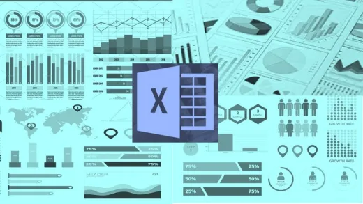
Did you know you could create amazing Professional Looking Infographics using Microsoft Excel?  Are you Excited to explore the power of Microsoft Excel to create beautiful Visual and dynamic Infographics to make your Dashboards look smarter and be appreciated for your data Visualization Skills?   If yes, then you’re in the right place - and I am happy to have you here!

If you are in, then we're excited to announce a FAST-PACED, HIGH-VALUE COURSE that'll help you accomplish these goals!

--------------------------------------------------------------------------------------------------------------------

What are Infographics?

Infographics are graphic visual representations of Information, data or Knowledge  to present information quickly and clearly.

Why should you create them?

  • To Grab Your Target Audience's Attention

People are naturally drawn towards graphical elements which includes facts, stats, data and figures. Now, combine graphical elements with motion elements and you have a product which is compelling enough to grab eyeballs from the right audience.

  • Trend and Pattern Analysis

Improve cognition by utilizing graphics to enhance the human visual system’s ability to see patterns and trends.

  • To Position Yourself As An Expert

Animated infographics make use of charts, graphs, and other relevant information. This signifies the amount of research and efforts the creator poured in to produce content that is useful and visually appealing. This will not only get the eyeballs rolling with your Presentation Style but will get you the appreciation of your audience establishing you as an Expert. 

  • Taking this course will be the best decision you will make as you will not only take your MS Excel Skills to a different level but also you will be an expert in creating attention-grabbing MS Excel infographics that you can use in your next presentation, your website or your social media campaign or anywhere you want.

Instructor

Profile photo of Suhas Dakhole
Suhas Dakhole

Suhas Dakhole has more than 15 years of Quality ,Operations and Project Management experience. He has worked  with some of the Top MNCs at Senior Leadership Roles and as a Project Consultant. Suhas is a Computer Science Engineer from Mumbai University but learning never stopped for him. He believes himself to be a Lifelong Learner who loves to Teach. Working...

Review
4.9 course rating
4K ratings
ui-avatar of Pieter Nel
Pieter N.
5.0
1 year ago

Amazing course with such clear instructions and enough examples to practice.

  • Helpful
  • Not helpful
ui-avatar of Jose Angel Gomez Olivas
Jose A. G. O.
4.5
2 years ago

Muy bien explicado y seguimiento paso a paso, creo que solamente le faltaría que lo extendiera un poco más pero es entendible si quiere monetizar su enseñanza.

  • Helpful
  • Not helpful
ui-avatar of Gil Shahzada
Gil S.
2.0
3 years ago

The author added piercing/high pitched music track at the beginning and at the end of each session. It was really annoying. Also, it appears that some sessions were recorded in different time frame, hence the audio quality varied considerably. The microphone was placed at different distances, hence the echo was disturbing. Third, when the supporting data was created, most of the time there were no explanations on the thought process that is/are needed to create graphics. Fourth, the third of the charts appeared to be just the duplication of the same concept, for example, the flight chart, balloon & battery charts are a very slight variation of the same process.

  • Helpful
  • Not helpful
ui-avatar of Sanket Kulkarni
Sanket K.
4.0
4 years ago

Was very useful.
Good explanation

  • Helpful
  • Not helpful
ui-avatar of Andy Iskandar
Andy I.
5.0
4 years ago

Your course was great Suhas. Thanks a lot. It gave me an inspiration how to create "blowmind" chart with unusual technic in Excel.If there is a Powerpoint hack ..then your are a Excel hack. Thanks again...your course is so good.

  • Helpful
  • Not helpful
ui-avatar of Lucie Carter
Lucie C.
5.0
4 years ago

Really enjoying the easy navigation between formulas and design.

  • Helpful
  • Not helpful
ui-avatar of Achmad Perkasa Subarkah
Achmad P. S.
4.0
4 years ago

cucook meong

  • Helpful
  • Not helpful
ui-avatar of Fatima Ismaeel
Fatima I.
5.0
5 years ago

I think he made excel inforgraphics look easier than one can think. Thank you

  • Helpful
  • Not helpful
ui-avatar of Jessamyn Koehler
Jessamyn K.
4.0
5 years ago

The course work was good, i learned a lot. However, the audio was spotty - intro music is really loud while the lecture was sometimes hard to hear even with the volume all the way up and that was a little distracting.

  • Helpful
  • Not helpful
ui-avatar of Chinmay Ashtekar
Chinmay A.
5.0
5 years ago

Awesome Experience about the creating and presenting the Various types of Charts to the Management level. Superb Work done !!

  • Helpful
  • Not helpful
Leave A Reply

Your email address will not be published. Required fields are marked *

Ratings

Courses You May Like

Lorem ipsum dolor sit amet elit
Show More Courses