About This Course
Using practical real-world datasets to showcase how to visualize and analyze data with Python Pandas, scipy and numpy
This course is designed to teach analysts, students interested in data science, statisticians, data scientists how to analyze real world data by creating professional looking charts and using numerical descriptive statistics techniques in Python 3. You will learn how to use charting libraries in Python 3 to analyze real-world data about corruption perception, infant mortality rate, life expectancy, the Ebola virus, alcohol and liver disease data, World literacy rate, violent crime in the USA, soccer World Cup,
migrants deaths, etc.
You will also learn how to effectively use the various statistical libraries in Python 3 such as numpy, scipy.stats, pandas and statistics to create all descriptive statistics summaries that are necessary for analyzing real world data.
In this course, you will understand how each library handles missing values and you will learn how to compute the various statistics properly when missing values are present in the data.
The course will teach you all that you need to know in order to analyze hands on real world data using Python 3. You will be able to appropriately create the visualizations using seaborn, matplotlib or pandas libraries in Python 3.
Using a wide variety of world datasets, we will analyze each one of the data using these tools within pandas, matplotlib and seaborn:
Correlation plots
Box-plots for comparing groups distributions
Time series and lines plots
Side by side comparative pie charts
Areas charts
Stacked bar charts
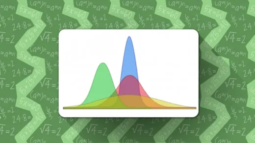
Histograms of continuous data
Bar charts
Regression plots
Statistical measures of the center of the data
Statistical measures of spread in the data
Statistical measures of relative standing in the data
Calculating Correlation coefficients
Ranking and relative standing in data
Determining outliers in datasets
Binning data in terciles, quartiles, quintiles, deciles, etc.
The course is taught using Anaconda Jupyter notebook, in order to achieve a reproducible research goal, where we use markdowns to clearly
document the codes in order to make them easily understandable and shareable.
This is what some students are saying:
"I really like the tips that you share in every unit in the course sections. This was a well delivered course."
"I am a Data Scientist with many years using Python /Big Data. The content of this course provides a rich resource to students interested in learning hands on data visualization in Python and the analysis of descriptive statistics. I will recommend this course anyone trying to come into this domain."
Create professional charts with real world data using Python 3
Understand Python 3 visual analysis tools and how to use them
Understand how and why some charting types are used to explore data in data science and Python


Sergio A. T. V.
el curso es interesante, falta un poco de fuidéz y planeación a las lecciones.